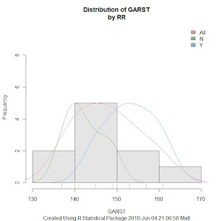
The R package Rattle will do this via the R Data Miner Gui, but I wanted to know how to do it without having to pull up the GUI each time. I thought the code would be more difficult than what it was, but it didn't take me long to figure it out.
When reading the documentation provided by the Data Mining Survivor guide, or one of these sources, I remember authors talking about how useful the Rattle log would be for learning R. I didn't think I'd learn much R this way, but I've been very surprised. For this graphic it was just a matter of copying code from the log and pasting into the R scripting window and making a few changes.
No comments:
Post a Comment